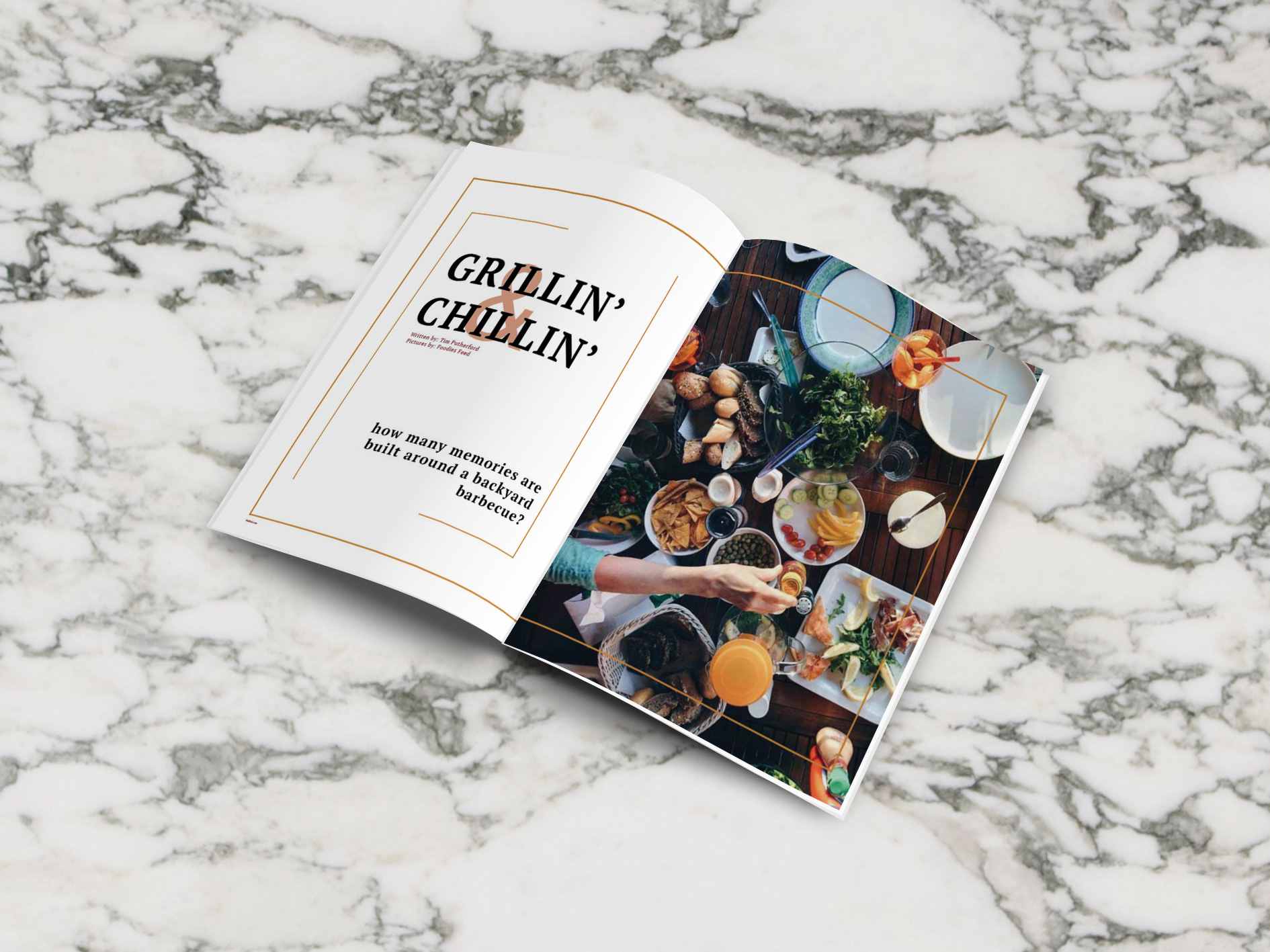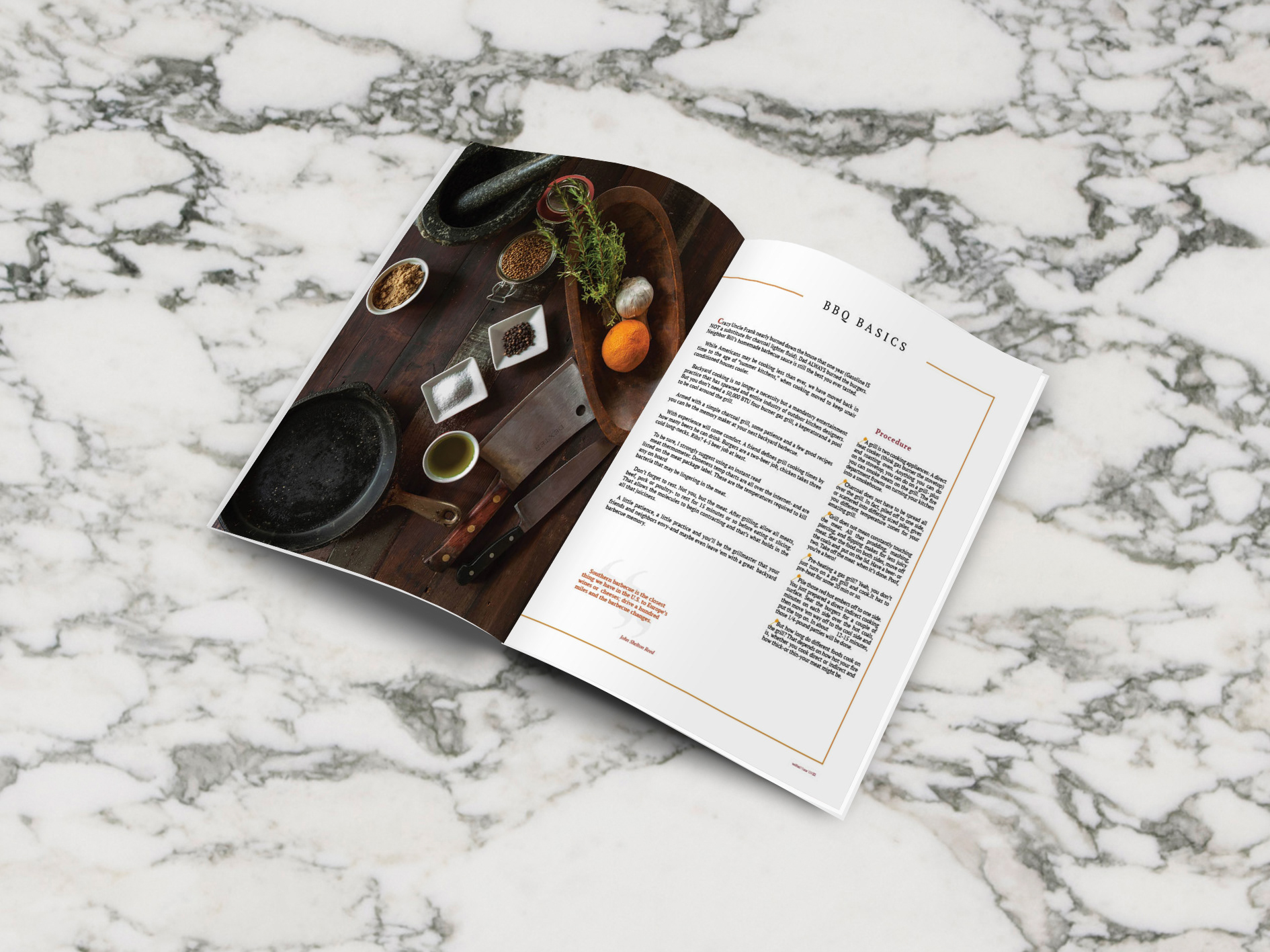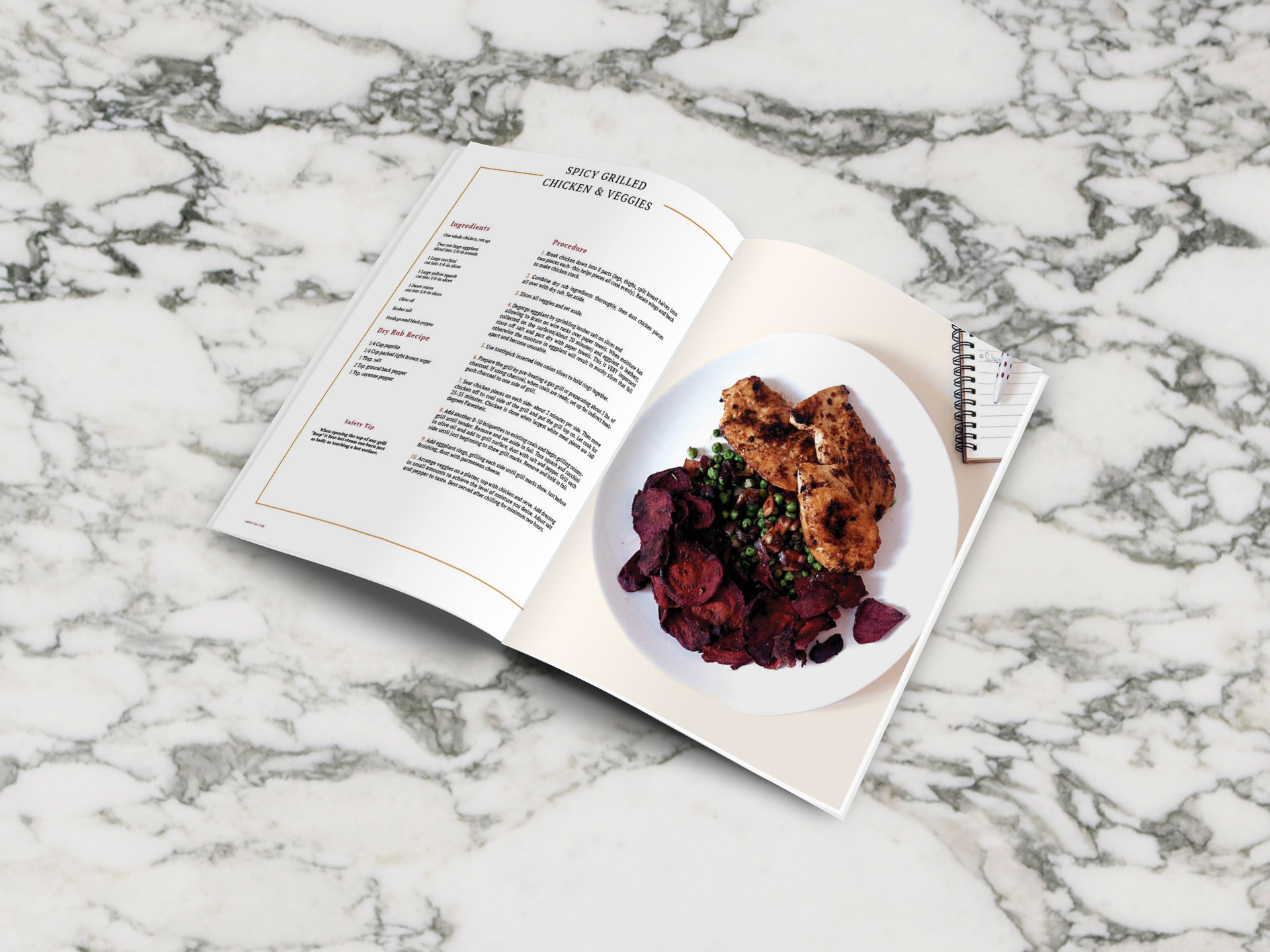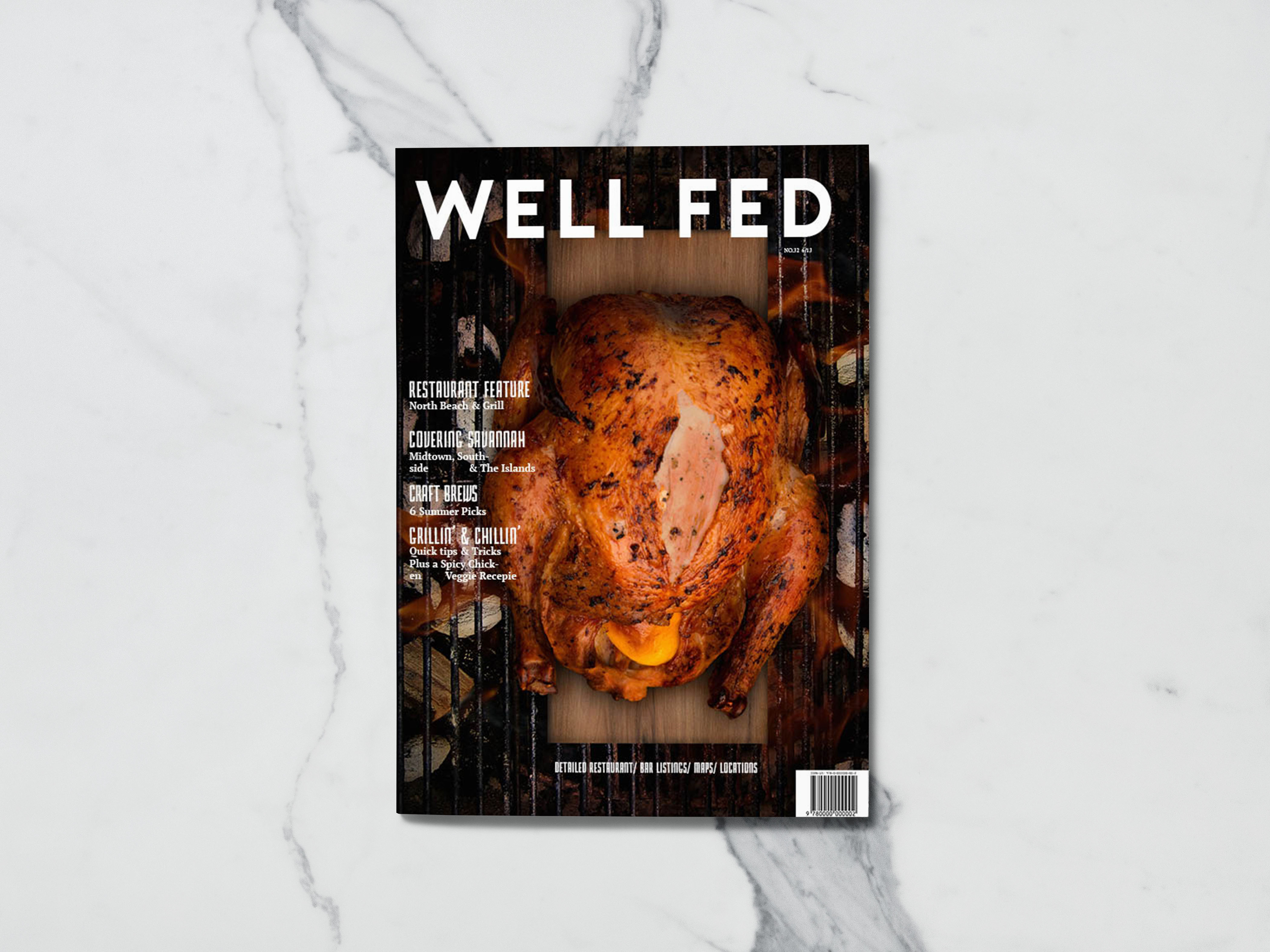
This project was intended for typographical practices. How type and image can play together. This project was about having a magazine, whether we loved it or hated it was not important, and re design it’s cover, an article introduction, and two articles. I decided to go for a local magazine call Well Fed. It’s a magazine that reviews restaurants and other local places in Savannah, GA. I decided to modernize it and make it look more elegant. The original magazine was heavy on text and information. I decided to use images, to make people hungry and excited, and lessened the use of text.